On analytical evaluation methods, the pace of AI product work, and why I think now is the time to invest in a user-free evaluation workflow.
When I was studying HCI, one of the things that genuinely excited me was the existence of methods that didn't need users. Not because I don't value user research — I do, deeply — but there's something intellectually compelling about the idea that you can predict real usability problems through pure analysis: by decomposing a task into its component steps, or by applying known constants about human cognition and motor behavior to estimate how long something will take. No recruitment. No scheduling. No consent forms. Just careful thinking about the relationship between a design and a task.
Hierarchical Task Analysis breaks down complex workflows into sub-tasks and reveals where the dependencies are, where the decision points accumulate, where the cognitive load concentrates. KLM-GOMS goes further — it assigns time values to individual human actions (a keystroke, a mouse movement, a mental operation) and lets you estimate with reasonable accuracy how long an expert user will take to complete a task before a single person has touched the interface. These methods have existed for decades. They are rigorous, reproducible, and the kind of thing a researcher can apply to the same design twice and get consistent results.
And almost nobody in industry uses them in their daily workflow.
The gap between what we learned and what we actually doLink to section
The reason is straightforward: these methods were designed for a research context. Running a proper HTA requires decomposing every step of every task. A full KLM-GOMS model for a complex workflow takes hours to build correctly. Heuristic evaluation — the most commonly taught analytical method, Nielsen's ten principles applied by an expert reviewer — is faster, but still requires a level of structured rigor that feels disconnected from the rhythm of most design work. So we do something else. We design, we share screens in Figma, someone writes notes in a review doc, the team aligns on what looks right, and the design ships. I'm not criticizing this — it's what the pace demands. But I've been thinking about whether that tradeoff is actually necessary, or whether it was only necessary before we had the tools to do something different.
Why AI products changed the problem for meLink to section
For the past few years I've been working on AI-powered enterprise products: specifically, systems where an AI agent doesn't just make suggestions but takes actions — autonomously detecting anomalies, surfacing recommendations, executing changes on behalf of users. The design problems here are different from what visual design review is built to catch. An interface can look entirely correct — clean hierarchy, clear flows, consistent design system — and still contain failures that have nothing to do with visual design.
The AI shows the user a confidence score with no explanation of how it was calculated, so the user has no way to verify the reasoning, only accept or reject the conclusion. An action that can't be undone sits one tap away with no confirmation — the button looks exactly like a primary action button should look, because that's what it is, and the failure is structural, not visual. After any decision the user makes, there is no accessible record of it; the AI's reasoning at the moment of decision is never captured. None of these things appear in a visual review. They require a different kind of question — not "does this look right?" but "does this keep the user in control of something that matters?" That question, I realized, is exactly what analytical evaluation methods were built to answer.
The standard heuristic set wasn't built for thisLink to section
Before going further, I want to make a specific argument that often gets skipped over. When designers talk about heuristic evaluation, they almost always mean Nielsen's ten principles: visibility of system status, match between system and the real world, user control and freedom, consistency and standards. These are good principles. They were derived from empirical observation of desktop software interfaces in the early 1990s — a world of menus, dialog boxes, form fields, and windows where software waited for the user to act, and the user's job was to navigate that software correctly.
They are not sufficient for agentic AI, not because they're wrong, but because they were built for a different set of problems. "Visibility of system status" asks whether the interface shows the current state. It doesn't ask whether the user can verify why an AI reached a conclusion, or whether there's a permanent record of a decision that an AI agent participated in, or whether the user can tell what the AI did autonomously versus what they themselves decided. Those questions don't exist in a world of menus and form fields — they are specific to systems that act on your behalf.
There's a related critique that gets raised whenever someone proposes expert-based evaluation: the claim that heuristic evaluation only catches trivial problems. The critique has truth behind it. Classic heuristic evaluation applied to a general interface does tend to surface surface-level violations — missing error messages, unclear labels, inconsistent button placement — while missing deeper problems like conceptual model mismatches, workflow-level failures that only appear across multiple sessions, or the kind of trust erosion that happens slowly over weeks of use. But I think this critique is really a critique of weak construct validity, not of the method itself. When a heuristic set is too general — when rules like "error prevention" can mean almost anything depending on who applies them — the evaluator surfaces whatever they can match to a rule, and the findings are shallow because the rules are shallow. The solution is domain-specific rules written as observable outcomes. A rule that says "the user can verify the AI's reasoning on the same screen as the data, without navigating elsewhere" doesn't produce trivial findings. If it fails, a specific bad thing happens to the user at a specific moment.
Why these methods are actually the right toolLink to section
Analytical and predictive methods — HTA, KLM-GOMS, heuristic evaluation — share one important property: they don't require users. They require knowledge of the domain, knowledge of the task structure, and a disciplined application of principles to a design. The evaluator is doing the cognitive work that a user would do, using expertise as a proxy. This is exactly what I needed, not because I don't want to talk to users, but because getting access to the right users, in the right context, with the right tasks, takes coordination across product, research, legal, and procurement teams. It takes weeks. And in AI-era design work, the pace often doesn't allow for weeks between iteration and evaluation.
The problem was never that analytical methods couldn't work for AI product evaluation. The problem was that the available heuristic sets weren't specifically designed for agentic systems, and applying them rigorously took more time than most design cycles allowed. What changed my thinking was this: if the bottleneck is the time and effort required to run a thorough analytical evaluation, and I now have access to AI tools that can do the structural analysis work at a fraction of that time cost, then the methodological knowledge I accumulated in HCI school is suddenly much more deployable than it was. The methods were always right. The delivery mechanism was too slow.
Building the framework and its outputsLink to section
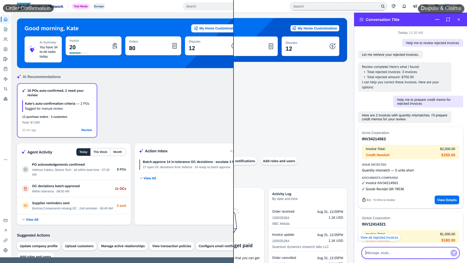
The TRACE framework didn't emerge from theory alone — it started from practice. I had two AI agents to evaluate: an Order Confirmation agent and a Dispute agent, both part of the same Transactional Documents product family. I ran both designs through the PAIR and HAX guidelines in full. The process surfaced real problems, but the output was unwieldy — both frameworks are written for general AI products and produce a long, undifferentiated list of findings that is hard to act on when you are trying to evaluate a family of related agents repeatedly. What I needed was a tighter, derived set: a checklist specific enough to this class of agentic experiences that I could apply it to the next agent, and the one after that, without starting from scratch each time. So I took the recurring findings, the highest-risk patterns, and the gaps the original frameworks only partially addressed, and distilled them into an initial heuristic set.
That initial set was a good first pass, but I wasn't confident it was comprehensive enough to be definitive. Then two new sources arrived. My organization's internal research team published a set of UX principles for human-agent interaction — eight principles grounded in enterprise agentic contexts, covering things like users retaining control with the ability to pause or stop actions before critical decisions execute, visibility into agent confidence and its limitations, and the ability to verify what an agent did and why. Shortly after, my manager shared a design checklist adapted from the assistant experience readiness work, which included principles I found particularly valuable: separating intent shaping from execution, designing for recovery rather than just success, and explaining for confidence rather than curiosity — meaning the AI should explain itself because the user needs to make a decision, not as a performance of capability.
With these two new sources in hand, I went back to my initial heuristic set and triangulated. I mapped every rule I had derived against the new principles to check coverage — was each rule grounded in at least one verified source? Were there principles in the new material that my initial set had missed? That triangulation process extended the set from seven rules to ten, added three conditional rules that only apply in specific interaction patterns, and gave every rule a traceable source rather than just my own judgment. The result was something I felt confident presenting not as personal opinion but as a framework with a defensible methodological basis.
From that process I derived a set of rules, each written as an observable outcome rather than a vague quality. Not "the AI explains its reasoning," which could mean almost anything, but "the user can read a plain-language explanation on the same screen as the data, without navigating elsewhere." That is observable. Two evaluators looking at the same design will converge on whether it passes or fails. This distinction between vague qualities and observable outcomes is what the research literature calls construct validity. An evaluation instrument has strong construct validity when its rules actually measure what they claim to measure, in a way that can be applied consistently. Without it, you get findings that look rigorous but aren't — you check boxes, you move on, and the design ships with the same problems.
The framework produces three outputs that work together. A heuristic evaluation table scores each rule against the design and records the specific failure when something goes wrong — it is the structured backbone of the evaluation. An annotated findings layer marks each screen element with what works, what does not, and why, color-coded by severity and surface. And a step-by-step user journey map traces how a person in the declared situation moves through the full task from the moment they receive the notification to the moment they complete the last action, noting what they experience and how they feel at each step. That third output is what makes the evaluation human — it forces the evaluator to simulate the cognitive and emotional state of someone who does not already know the system. But producing it immediately surfaces a problem I had not anticipated.
Why personas break evaluation — and what to use insteadLink to section
A user journey map traces how a specific person moves through a task, which means you need to define who that person is. My first instinct was to anchor it around a persona — give the user a name, a job title, a set of habits, and simulate their experience. The problem revealed itself quickly. Two people evaluating the same design using the same persona will imagine two different people. One evaluator's "account administrator" is cautious, reads every dialog, and takes her time. Another's is rushed, skipping through confirmations because she has fifteen other things open. Both are valid interpretations. But they produce different journey maps for the same design, and the variance is not in the design — it is in the evaluator's imagination. This is what researchers call an inter-rater reliability problem, and it gets worse the more complex the persona is.
The solution was to remove the persona entirely and replace it with three things that do not vary between evaluators: the situation, the job, and the acceptance criteria. The situation defines what has already happened that brings this person to this screen — not who they are, but what just occurred: an automated system has surfaced possible duplicates without the user requesting it, and they have received a notification. The job defines what the person is genuinely trying to accomplish and what the real stakes are: resolve the duplicates accurately, protect data integrity, and maintain a record of decisions that can be defended later. The acceptance criteria define what success looks like in observable terms — not feelings or impressions, but specific testable outcomes: can they see the AI's reasoning, verify the evidence, reverse a decision, find a record of what was decided? Two evaluators working from the same situation, job, and acceptance criteria will converge far more reliably than two evaluators imagining the same fictional person. The journey map survives this shift intact — it traces what a person in this declared situation typically experiences at each step, grounded in domain knowledge rather than in a fictional character's backstory. It just no longer needs a name attached to it.
The measurement problem nobody talks aboutLink to section
Once you have a set of rules, you need a way to measure improvement over time, and this is where I see most teams go wrong. The intuitive approach is to assign severity ratings to each finding, add them up, and compare totals across evaluation cycles. A score of 47 drops to 31, and that looks like progress. The problem is that severity ratings are ordinal data — they represent a rank order, where critical is worse than needs work, but the gaps between levels are not defined. Critical is not twice as bad as needs work in any measurable sense. When you add ordinal values and compare totals, you get a number that has the appearance of precision without the substance. This is what researchers call false precision: the score looks meaningful, but the arithmetic has no basis.
What I used instead was simpler and more honest: a finding-level transition table. For each rule, I recorded its state at baseline and its state after the redesign cycle, tracking how many findings moved from critical to good, how many stayed critical, and how many moved from needs work to good. From that table, you can make statements that are actually defensible: eight of nine applicable findings improved, one critical failure was eliminated, one remained open, and the remaining risk is concentrated in a single area. That is not a score — it is a specific description of what changed and what did not, pointing directly at what needs to happen next, without claiming mathematical precision that the underlying data does not support.
What I found when I applied itLink to section
I ran this framework on an AI-powered enterprise product where an agent autonomously detects possible duplicates in a dataset and surfaces them to an administrator for review. Every decision the administrator makes has downstream consequences that can't be reversed. The evaluation surfaced findings that no visual design review had caught. A single button that permanently merged enterprise accounts with no confirmation. A system with no memory of any decision ever made — the AI's reasoning at the moment of decision was never captured, and overrides applied silently. These were compliance and accountability failures that had nothing to do with how the screens looked.
The design team addressed the findings directly. The triage panel was rebuilt as a reading and routing surface only, with no permanent actions available there. All irreversible changes moved to a multi-step workflow gated behind validation and a mandatory confirmation step. The AI's evidence became visible in the interface — not a confidence percentage, but the actual compared values that the score was based on. On re-evaluation, eight of nine findings improved. The confirmation gap was eliminated. The audit trail gap remained open because it required building a new capability rather than redesigning an existing one. That's an honest result: the evaluation told me exactly where the work was done and where it wasn't.
What this approach cannot doLink to section
I want to be honest about the limits, because intellectual honesty about methodology is part of what makes it useful. Analytical evaluation cannot catch problems that only appear when someone who doesn't already understand the system encounters it for the first time. This is the curse of knowledge — the difficulty of simulating not-knowing something while knowing it. An expert evaluator understands what the AI is doing and why; a first-time user might not, and that gap is invisible to any form of expert analysis. It also cannot catch trust erosion over time: a confirmation dialog that is clear when read carefully can become invisible after you've clicked through it dozens of times, and a single evaluation session sees a snapshot, not a trajectory. And it cannot tell you whether users systematically misunderstand what an action means — which is a mental model problem that requires real users to surface. Analytical evaluation is the right first pass, not a replacement. It eliminates the problems that can be caught through expert judgment, so that when research investment is available, it goes toward the genuinely hard questions that require human participants in real contexts.
Why I think now is the right timeLink to section
The gap between what analytical evaluation methods can theoretically do and what they practically cost has always been the reason designers don't use them daily. That time cost hasn't disappeared, but the tools available to process information, trace task flows, analyze design artifacts, and surface structured findings have changed dramatically. An evaluation that would have taken days of careful manual work can now be structured, applied, and synthesized in a fraction of that time. The judgment is still the hard part — deciding whether a specific design decision violates a specific principle, articulating why, and naming the user experience consequence requires domain knowledge and methodological rigor that no automation produces automatically. But the structural analysis work, the tracing of every step and the production of the artifacts that make findings communicable, can be distributed. The methods I learned in HCI school were always the right approach for this kind of evaluation. What I'm building now is the delivery mechanism that makes them viable at the pace that AI design work actually moves.
What comes nextLink to section
I've started building this into a repeatable workflow. Before any evaluation, I declare three things: the fidelity of the design, which determines which methods apply; the situation and job being evaluated, which replaces the persona with something reproducible; and whether I'm establishing a baseline or measuring against one. The output is always the same structure — a heuristic evaluation table, an annotated findings layer, and a step-by-step journey trace that follows a user in the declared situation through the full task, noting what they experience, what they feel, and where the design supports or fails the job they're trying to do. I run it on every significant design cycle, compare findings against the previous evaluation using the transition table rather than a score, and publish the delta: specific, honest, pointing directly at what changed and what didn't.
This is still an experiment. I've run it through a few rounds of design improvements now, and each cycle has validated something — a critical failure caught before it shipped, a re-evaluation that proved a redesign actually moved the needle, a finding that surfaced a problem nobody had named yet. That's enough to convince me the approach is worth continuing. But I also know I'm not close to the ceiling of what this could do. The framework is first-generation. The heuristic set will need new rules as agentic interaction patterns evolve. The workflow is still partly manual in ways it doesn't need to be. I'm continuing to push on it, and if you're working on something similar or thinking about it, I'd be interested to hear what you're finding.