Case study
OverviewLink to section
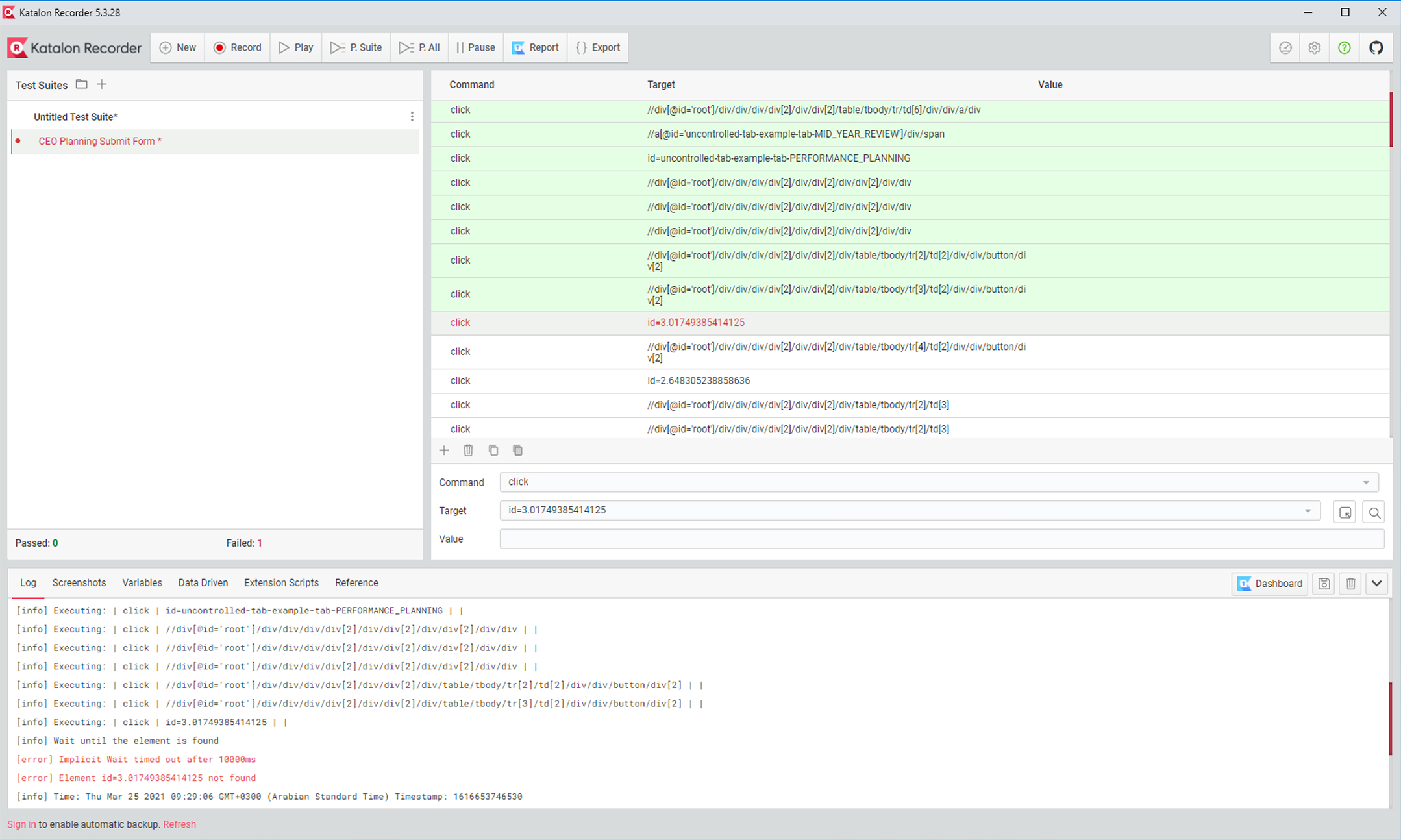
Katalon Recorder (KR) is the Selenium IDE-compatible record and playback tool for browser automation testing. It lets users automate web testing and manual browser tasks effortlessly from the browser — no coding required. The product had caught up with its direct competitor, Selenium IDE, in terms of feature coverage. But it shared so many similarities in UI and UX that users couldn't tell the two apart. Product Management decided a redesign was needed for pivotal growth.
As the Lead Product Designer, I was responsible for conducting user research and evaluation using a variety of methods: Heuristic Evaluation, contextual inquiry, affinity mapping, and Interface Layout Analysis from Human Factors discipline. I also created both low and high-fidelity mockups to conduct Usability Testing and drive implementation.
Timeline
8 weeks
Jul–Sep 2021. A user-centered design process compressed into three phases: research, iterative design, and UAT.
Outcome
+33%
Increase in new users acquiring and executing test cases in subsequent quarters of 2021 and 2022.
Business context
Built by engineers, squeezed by a competitor that looked identicalLink to section
The information architecture and UI of Katalon Recorder weren't built properly for growth. The product had been built by the engineering team without any designer involvement, leaving the interface cluttered, inconsistent with Katalon's brand guidelines, and riddled with usability issues that users raised repeatedly in the community forum.
The competitive problem compounded this. KR had managed to close the feature gap with Selenium IDE, but the two products looked so similar that new users had no strong reason to choose KR. Without a distinct identity and a meaningfully better experience, growth was stalling.
Motivations & goals
Why this redesign had to happenLink to section
KR was losing ground to Selenium IDE not on features, but on experience and identity. The product needed a distinct, user-centered UI to convert new users and grow adoption of the flagship TestOps platform. Three goals defined the project:
Goal 1
New UI
Relayout and design a new UI to solve the top usability issues and reduce user friction.
Goal 2
Differentiate
Differentiate KR from Selenium IDE so the product can grow and outplay the competitor.
Goal 3
More users
Acquire more new users to KR and to the flagship TestOps platform.
Problem definition
Three structural problems making the status quo untenableLink to section
- 01
Information Architecture and UI weren't built for growth. With no designer involvement in the original build, the layout was cluttered and the structure made no sense at scale.
- 02
Inconsistent UI that wasn't aligned with Katalon's brand guideline. Visual inconsistencies across the product undermined trust and made KR feel unpolished relative to the platform it was meant to funnel users into.
- 03
A lot of usability issues raised by users on the community forum. Real users were documenting pain — this was a signal that had been accumulating without a design-led response.
Understanding users
Understand users' behaviours by using contextual inquiryLink to section
Product Managers and I decided to conduct Contextual Inquiry instead of in-depth user interviews to quickly learn users' usual behaviours and workarounds. The method gave us direct observation of the tool in its natural context — watching users work rather than asking them to recall it.
Study objectives
- ·To understand deeply the context that users operate in when using the product.
- ·To understand the strategies users adopt when creating and executing automation test cases.
Study parameters
- ·N = 6 participants — active KR users from various age groups, both genders, and different geographic regions (North America, Asia).
- ·Remote Contextual Inquiry — participants performed tasks in their usual manner while interviewers observed and asked questions in real time.
Leverage Nielsen Heuristic Evaluation to find usability problemsLink to section
Alongside the contextual inquiry, two Product Managers and I each conducted a heuristic evaluation separately — to avoid confirmation bias and capture different interpretations of the usability issues. We used Nielsen's 10 heuristics as our framework, focusing on violations that would most impact task efficiency and system feedback.
Identify all potential usability issues
Systematically surface problems that contextual inquiry might not expose — particularly edge cases and low-frequency but high-severity interactions.
Complement contextual inquiry findings
Triangulate between observed user behaviour and principled evaluation — giving us both empirical evidence and heuristic grounding for every design decision.
Three findings that shaped everythingLink to section
After analyzing all qualitative data from both the contextual inquiry and heuristic evaluation, three themes emerged clearly.
5 out of 6 participants complained the layout was too cluttered.
Most participants had to move their mouse around the interface to find desired action buttons. Although they could work around their tasks, they still demanded a better UI to reduce time on task. The layout was not supporting efficient navigation — it was forcing users to search rather than recognize.
Senior automation testers demanded more flexible test case management.
Senior testers said the product couldn't adapt to their complex application-under-test structure. Test folders needed to support nested subfolders and test cases in order to match real-world project hierarchies. The flat structure was a ceiling that power users had already hit.
Visibility of System Status was the most violated heuristic in our analysis.
The product lacked a feedback system to notify users of system status and the consequences of their actions. This created confusion whenever users initiated an action — they couldn't tell if anything had happened, or what would happen next. A fundamental Nielsen violation that was eroding trust in the product.
User Personas of Katalon RecorderLink to section
The research surfaced three distinct user types — each with a different relationship to automation testing and a different set of needs from the tool.

Persona 01
Nate
The Automation Engineer
"I tried Katalon Studio but it had limitations on length of test case, it was hanging. Overall it just seems too heavy-weight for my need."
JTBD: Generate automated Selenium tests
Persona 02
Ivan
The Automation Newbie
"I chose Katalon Recorder over Selenium IDE because the time to test creation in KR is much faster."
JTBD: Kickstart test automation in the current project

Persona 03
Annie
The Non-tech Manual Tester
"I don't have a tech background so I can't write automation scripts. I have to take a course in software development to prepare for my automation QA journey."
JTBD: Perform boring and repetitive tasks on the browser
Design goals
From research to actionable design directionsLink to section
Three clear goals emerged from the research and PM alignment. Each mapped directly to one or more findings and set the success criteria for the redesign.
Relayout and design a new UI to solve top usability issues
Address the clutter finding directly — separate distinct areas of the interface, reduce mouse travel, and apply a layout that supports recognition over recall.
Differentiate KR from Selenium IDE
Build a distinct visual identity aligned with Katalon's brand so the product can grow on its own merits and not be perceived as an IDE clone.
Acquire more new users to KR and to the flagship TestOps platform
A better KR experience was a pipeline for the broader Katalon platform. Improving the entry-level product was a strategic move to grow the top of the acquisition funnel.
Enable flexibility for test managementLink to section
Senior automation engineers needed to manage test cases in structures that matched their application under test — complex, multi-level hierarchies that the flat folder model simply couldn't support. We designed a replacement: a nested structure that allows folders to contain both subfolders and test cases, adapting to any real-world project context.
Relayout to improve efficiency and clarityLink to section
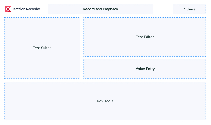
To revise the UI layout, I used Interface Layout Analysis from the Human Factors discipline — a technique for evaluating layout against functional criteria such as frequency of use, importance, and logical grouping. Differentiating the test management area from the editor with distinct visual treatments and prominent display of test case names was the central layout decision.
Allow using external Test Data filesLink to section
Senior participants wanted to use external Test Data files so they didn't have to duplicate test cases with different test data — a core need for achieving meaningful test coverage across parameter variations.
Visual design
Follow the visual principles of KatalonLink to section
I audited the existing foundation document of Katalon Recorder and updated the colour palette and visual language to align with the new Branding and Product Strategy. The redesign was anchored in three principles from Katalon's brand system.
Clean
Our platform and brand design echo the simplicity and ease of use that Katalon delivers. There's no unnecessary complexity or clutter to weigh us down.
Accessible
We're made to be used by everyone — a variety of users with various needs and budget levels. Our visual language should speak to our practical, approachable product and team. We're not intimidating or out of reach for anyone.
Dynamic
We're forging a new path in our industry. Being dynamic allows us to channel the blue sky potential of our comprehensive platform and partnerships.
The Design System of Katalon RecorderLink to section
I audited the existing foundation document of Katalon Recorder and updated the colour palette and component tokens to align with the new Branding and Product Strategy. The Figma-based design system served as the single source of truth for implementation handoff.
Streamline in-app navigation with a sidebar menuLink to section
To improve user navigation and centralize related menus and actions, I designed a dedicated sidebar menu. This sidebar consolidates essential elements of the application — Test Suites, Test Cases, Test Data, Profiles, and more — into a single, always-accessible panel. It directly addresses the clutter finding: instead of all actions floating in a single flat interface, users now have a clear mental model of where things live.
Evaluation & testing
Quickly troubleshoot usability issues with RITELink to section
To quickly evaluate the design, we used the Rapid Iterative Testing and Evaluation (RITE) method with a small sample of internal users and research participants. RITE allowed us to identify and fix issues in tight cycles rather than accumulating findings for a single post-test analysis session — issues were fixed between sessions, not batched after all testing concluded.
Major findings
Major findings and uncovered insightsLink to section
Based on the usability test and follow-up interviews, these were the most pressing issues that needed to be addressed before launch.
After each RITE session, critical issues were fixed before the next one. All three findings above were prioritised and resolved prior to the User Acceptance Testing phase, where Product Managers recruited end-users while I observed them using the product.
The impacts
Reflect on the project outcomesLink to section
Impact 1
+33% users
We observed a surge in new users importing and executing their test cases during the subsequent quarters of 2021 and 2022, attributable to the redesign.
Impact 2
Differentiated
Katalon Recorder successfully distinguished itself from its direct competitor. Users now perceive it as an essential tool for starting their automation testing journey — not a Selenium IDE clone.
Mistakes and limitationsLink to section
Two honest lessons came out of this project.
Sample strategy was biased. We made an oversight by recruiting only active users for the qualitative study. To ensure objective findings, we should have also included users who had stopped using Katalon Recorder. Churned users would have surfaced different — and likely more critical — pain points than active users who had already found workarounds.
A lot of usability issues were still not fixed. Due to a tight timeline and limited human resources, we prioritised fixing only the highest-impact usability issues. Many other issues remained unresolved and were stored in the backlog. The three RITE findings are a reminder that time-boxed research always leaves things on the floor — and that a roadmap for post-launch improvements should be scoped alongside the initial launch, not after it.