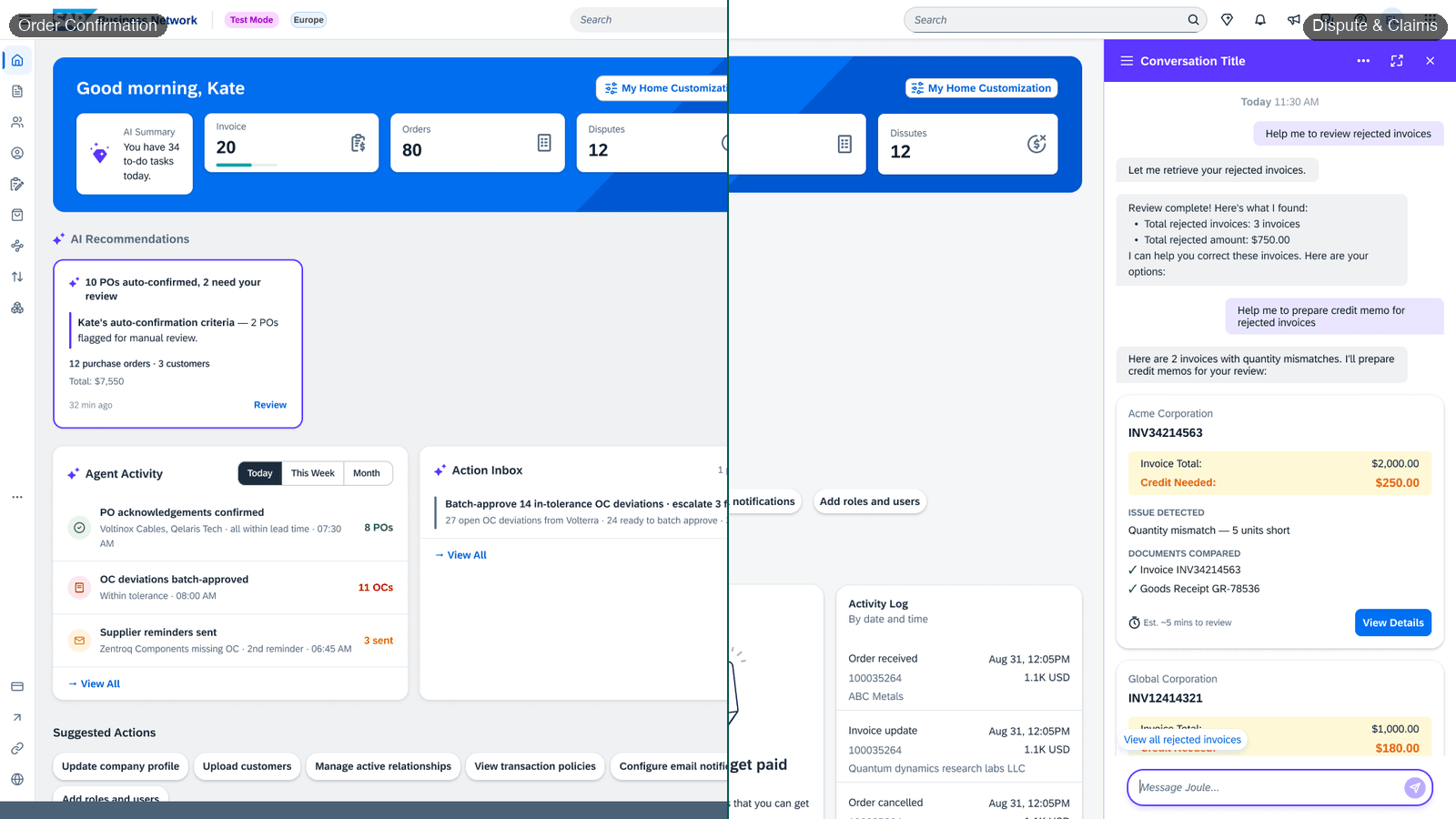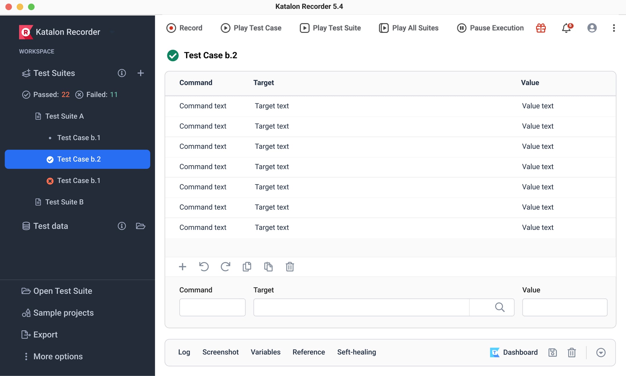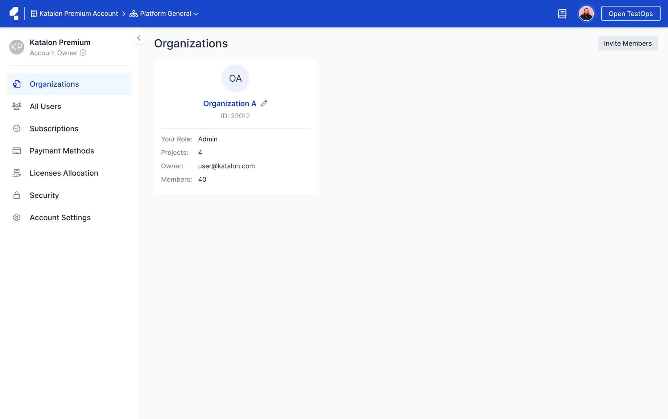
The design team proposed a thorough revamp of the "SalesHood" platform, a corporate sales enablement tool. Following a user-centric approach, we employed methods such as user interviews, competitor analysis, and persona development. This led to the creation of new features and a comprehensive restructuring of the platform. The redesigned platform now includes many new features. The final design was showcased using prototypes and promotional videos to Board of Director.
Overview
Final DesignLink to section
The entire platform was redesigned using a new visual design language. A design system was also implemented to maintain consistency across the platform. The number of improvements made is too numerous to count.
Context
Problems and ContextLink to section
In 2019, the team faced challenges in enhancing two key elements of the platform, Huddle and Path. These elements were rigid and complex, making it hard to modify them. Customer needs often led to creating patches or workarounds, like the new Path type - Dynamic Due date, instead of substantial improvements.
"This software is great for serving up evergreen content to your employees, but when trying to manage learning content that needs to be updated from time to time, it can prove very difficult if you have used it as a way to store your content."
SalesHood platform is losing customers and revenue due to complicated core object logics, lack of flexibility for different use cases, outdated UX design, and inconsistent user interface elements leading to a messy platform.
Goals
GoalsLink to section
Transform the platform into a versatile, user-centric tool that promotes independent learning and enhanced interaction
1
2
3
4
Research
ResearchLink to section
Comprehensive user understanding through multi-channel feedback and analysis
We've dedicated considerable time and effort to understanding our clients. We've learned about their everyday challenges, how they use our platform, the issues they want to address, and their pressure points both within and outside Saleshood. This understanding has come from going through tickets, customer interviews, questionaires, NPS feedback, and more.
Through analyzing hundreds of customer quotes and conducting interviews with 14 individuals from various sectors, we gained a clear understanding of our users' challenges.
"You need to define what coaching means"
"SalesHood is very slow. It takes me more than 30 seconds to find a file"
"UI is confusing for somebody looking for sales tool versus learning content"
"Very difficult to find things"
"If that person is a reader, I will give content, if that person is watcher, I tell them to rewatch video"
"Team dashboard currently's just a step up of sales sheet in an email"
Utilizing "Jobs to be Done" for Effective User Story Development
The team leveraged the "Jobs to be Done" method for crafting user stories, enhancing their effectiveness by incorporating specific contexts and pain points from interviews. User stories were divided among the team members for four key personas and categorized with tags in Notion for easy identification.
Solution
SolutionsLink to section
Iteratively brainstorm solutions for existing conceptual models.
Using user stories, insights, and interviews, we brainstormed from a vague concept to a fully developed justification. We focused on diagramming, structuring models, and important use cases. This allowed us to test ideas, get early feedback, and iterate design criteria. After various iterations, the team agreed on the direction.
Based on the list of stories and concepts we created, we held several brainstorming sessions to name the key features. We then sorted these features into their respective concept folders. Features marked in blue are existing ones in the current product that need improvement. Purple features originate from insights into NPS pain points, and green features are derived from interviews.
We iteratively sketched user flows and wireframes for each feature and screen using Whimsical until we finalized and logically organized these wireframes.
Seeking for a new visual direction by using style tiles method
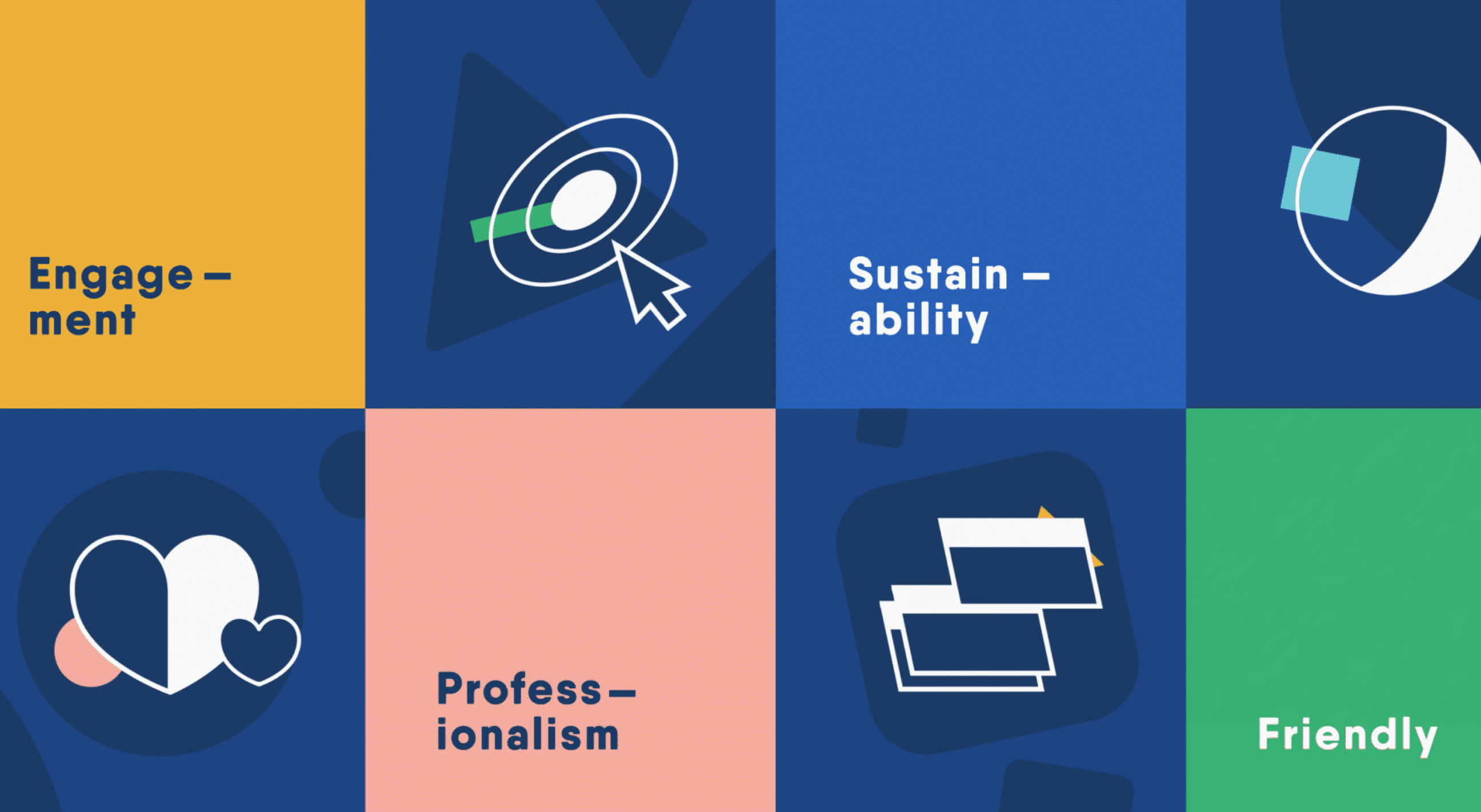
The visual design involved a detailed process to create a fresh, user-friendly interface. The new design responded to customer complaints about the previous interface, focusing on dynamism, color, abstract geometric illustrations, balanced iconography, and ease of use.
Final Designs
Final DesignsLink to section
The Challenging and Rewarding Journey of Redesigning SalesHood
The homepage is designed to engage and inspire users with relevant updates and facts. It's crucial to offer users the ability to explore and personalize content, fostering active learning. Participants are encouraged to join relevant topics and courses independently, promoting active engagement and skill development.
SalesHood's "Template and Events" feature was renamed to "Curriculum and Session". Coaches create the curriculum, and Managers use it to plan their own learning sessions.
Huddle, our platform's core object, contains various learning activity modules. We refined the structure from many types to four distinct modules: reading, video, pitch, and exercise. This made module creation simpler and more flexible.
The new analytics feature will gather data from all programs to provide users with visual insights on their progress and learning outcomes, also a totally new experience of building a module instead of conventional forms.
Based on user input, we created customizable dashboards for efficient access to key information and activities.
The Discussion Hub is a space for users to share ideas, seek support, and contribute to training, fostering increased engagement and active participation in the platform.
Outcomes
OutcomesLink to section
Strategic impact
North star
The redesign became the pivotal foundational research for the entire company, influencing the board of directors and shaping the product roadmap.
Visual language
Established
A new design language was created for SalesHood and promptly incorporated into the product roadmap.