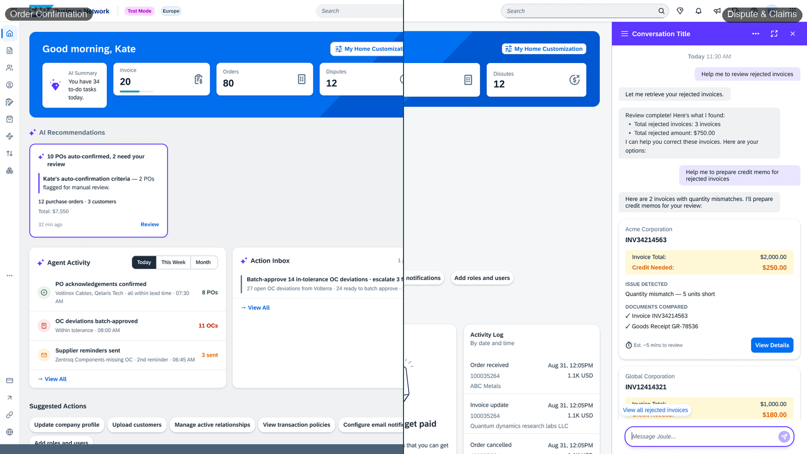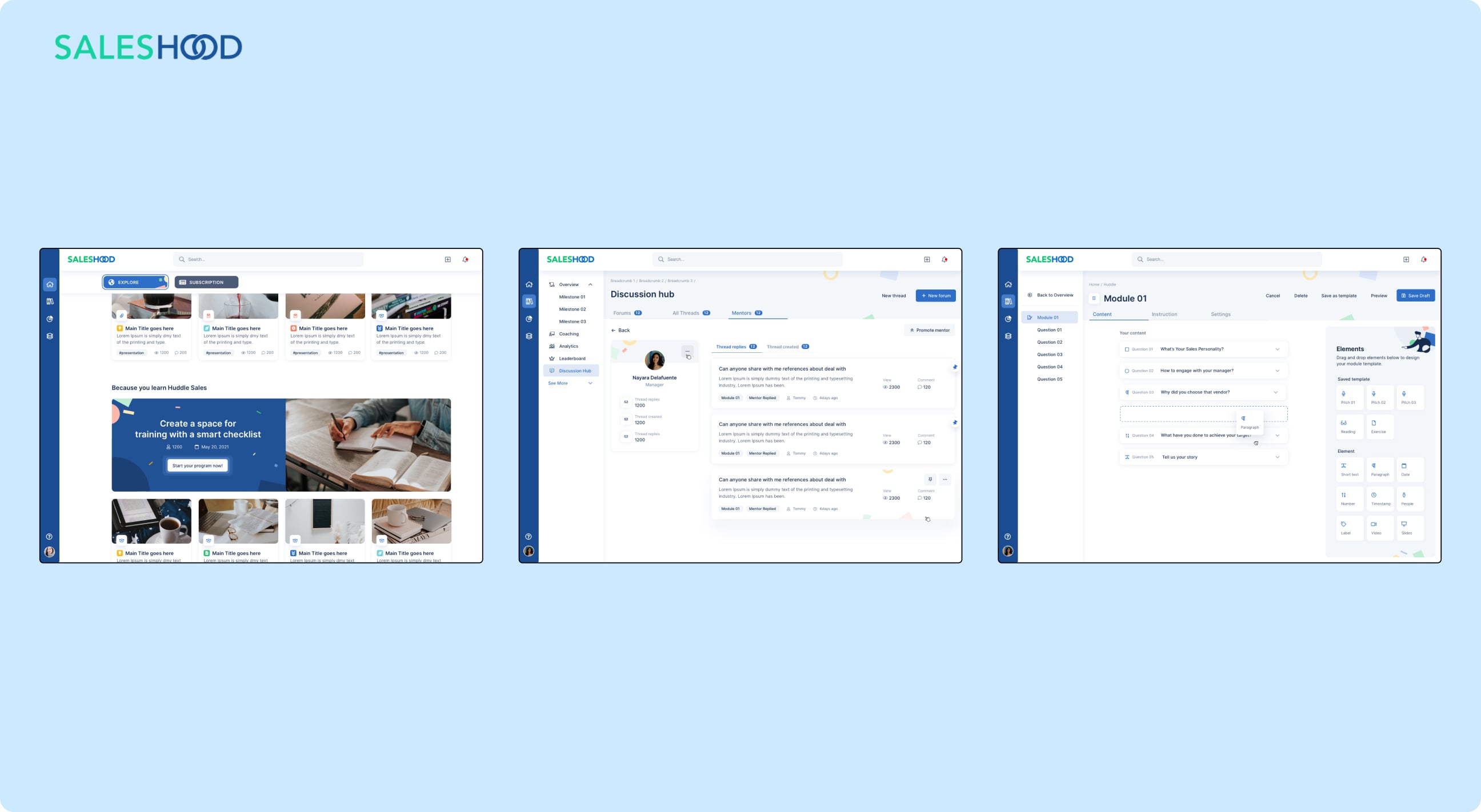
The Hoodie Design System by SalesHood Inc. was developed to unify the platform's design language. It involved a UI inventory audit, foundation guidelines, grid system, typography, color schemes, and component symbols. A design token system was also implemented for CSS property control. The project streamlined the design process, improved user experience, and enhanced designer-developer collaboration.
Final Design
Final DesignLink to section
Context
Too many inconsistencies in our user interfaceLink to section
- The product team faced challenges with brand identity and UI consistency due to the absence of a unified design language across platform.
- This led to customer frustration, misuse of UI components, and unnoticed bugs.
- Designers and developers often misused or modified design mockups, leading to further inconsistencies.
Goals
Not only to enhance the UI and aesthetics but also to optimizing and simplifying our build approach.Link to section
1
2
Initial Setup
A solid workflow between designers was the first corner stone we madeLink to section
As part of the design team at SalesHood, I helped establish a workflow that mirrored that of the developer team. This strategy was aimed at fostering a more structured mindset among us designers. We used Abstract for managing and controlling every workflow in our project's design system.
We made a firm commitment as a team: all design would take place in Abstract, files would be named and organized for easy navigation, and everyone would share their process and output in Abstract through commit messages, branch summaries, and comments.
Mirroring the file structure to resemble that of our codebaseLink to section
We break down all components into individual sketches for easy maintenance and finding. This also helps reduce the file size and loading time in Abstract. We aim to map 1:1 with our codebase to make Sketch the source of truth, where all design decisions are made by the designers.
Documenting as we designLink to section
The most challenging task for me involves creating guidelines and usage components, along with patterns and visual strategies. Initially, I used Google Docs to draft proposals and documents for my team leader to review. However, once I discovered Notion — a fantastic tool for storing and managing documents — I dedicated 90% of my time to it, and 10% to Google Docs. Despite its decreased usage, Google Docs remains the official and conventional method for document creation in our company.
Auditing user interface inventory helps us to know all variants of the components and their importanceLink to section
A user interface inventory, or an audit, can help uncover unnoticed issues. In a recent audit, I found over eight variations of the same button component. Nobody knew how many variants exist until we audited the UI inventory.
Process
Composing a foundation guideline for designersLink to section
A design system requires a solid foundation before proceeding to any other step. Truthfully, our team had the hardest time figuring out what needed to be set up. We discovered that the Lightning, Atlassian, Carbon, and Zen Desk Design Systems have similar foundational guidelines. Eventually, we agreed to prepare the following files:
TypographyLink to section
We utilize InterFont for our projects. InterFont has a tall x-height, which enhances readability for mixed-case and lower-case text. It includes OpenType features like contextual alternates, which adjust punctuation based on the shape of surrounding characters, slashed zero, which distinguishes "0" from "o," and tabular numbers.
ColorsLink to section
We used focused and meaningful color to highlight exactly what people need to see. To comply with the AA standard, we selected primary, secondary, and extended colors that enhance usability by ensuring sufficient contrast between elements.
Hoodie's colors are derived from the Saleshood design language color palette. Dark Blue is the predominant color in our default theme, with its shades used to structure content.
The core Blue family is the main action color across all SalesHood products. Additional colors are used minimally and purposefully.
Components
"One symbol to rule them all"Link to section
Our strategy involved creating various versions and states of a component, allowing for easy drag-and-drop into our mockups. This was a common practice, but updating hundreds of symbols for each minor improvement proved to be a daunting task. As a result, we adjusted our approach to component creation. Now, we strive towards building highly nested symbols composed of multiple individual atoms.
Design Tokens — The core power of design systemLink to section
For Hoodie Design System, we have our own naming convention and tokens to manage and control CSS properties. We can deduce a predictable structure for design token format based on the Component Anatomy:
Outcomes
OutcomesLink to section
Technical debt
Reduced
Teams can iterate over the product more efficiently without accumulating inconsistencies.
Build & design speed
Faster
Hoodie components enable continuous product feature development with reusable building blocks.
Test effort
Reduced
QA can focus on functional testing — visual regression is handled by the design system.
Consistency
Unified
A consistent look and feel across the entire SalesHood platform.